MOSH Lab

My NSERC funded Mountain Snow Hydrology (MOSH) research group is up and running! Check out our new online home at www.moshlab.org – this is also where I will try to stay on top of news, research, and publications.

This personal wordpress blog will stay as sporadically active as it ever was.


Review: “Positive Impacts of Human CO2” by P. Moore

[Edit: Sat on this post for a while, but since the ‘graph’ is making the rounds again, decided to release it as is. The report, if you’re interested, is here]

[Edit 2: The report lists Deb Solberg as the contact for media inquiries. Deb Solberg is married to Monte Solberg, who was a Reform/Conservative MP for Medicine Hat.]

[Edit 3: This post is meant to draw attention to how ridiculous the report is, and to highlight how extremely shoddy science is the last refuge of those who deny the role of humans in ongoing climate change.] 


The Frontier Centre for Public Policy (FCPP), a conservative think-tank based in Canada, has published a report by Patrick Moore on the positive impacts of human CO2 emissions.

This post-publication review will follow a standard academic review template: I will summarize the paper, offer general comments on the scientific merit of the study, and  I will provide specific comments on the methods used, interpretation of the results, and the use of supporting literature.

Summary

The main conclusion of this report appears to be that, based on an extrapolated trend in atmospheric CO2 over the past 140 million years, life on earth will start to fail in two million years as CO2 levels drop below a threshold for plant growth. Thus, the human extraction of fossil fuels and emission of CO2 through combustion is actually a good thing, as it will keep plants growing.

A general issue which comes up again and again is one of scale. The author appears to be concerned about trends on relatively long timescales (140 million years) and the collapse of the global biogeochemical carbon cycle, but is apparently unconcerned about massive shocks to this same cycle on century timescales (i.e. through combustion of fossil fuels).

Overall the report is clearly written, but incompletely and inappropriately referenced (Breitbart does not count as a peer-reviewed source).

General Comments

  1. The main thrust of this paper is that based on trends in CO2 from the last 140 million years, life on Earth will perish completely in 2 million years. The ‘trend’ in CO2 is never quantified, and instead appears to be based on a purely visual approximation (see graph below). This type of trend estimation is a serious abuse of statistics, as the time axis is not linear(!), and the authors do not provide any regression line parameters or coefficient of variation. Not to mention the fact that the CO2 data and the temperature data are of unknown quality (see point 2 below).

    Moore-Fig2

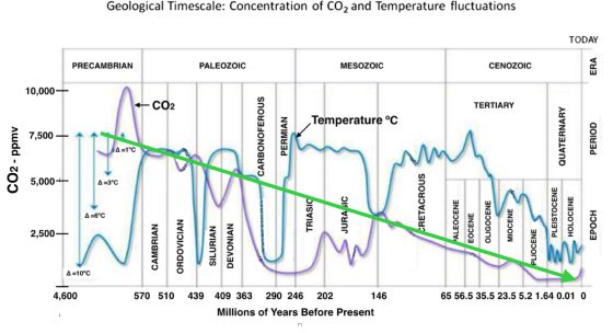
    Figure 2 from Moore (2016). Note the non-linear time axis, and the bright green linear trend line with a helpful arrow.

  2.  Caption for Figure 1 notes that the geological time-scale data for CO2 and temperature show that they are not in “lockstep”. The provenance of these data is not clear – the graph appears to be taken from a website, and the data are somehow cobbled together from a number of different sources. More reliable and recent ice core data (such as that shown in Figure 5, or see for example Petit et al., 1999) clearly show the strong relation between CO2 and temperature over the last 1 million years, which is arguably more relevant for human purposes.
  3. Figure 3 is a graph from Jo Nova (not a credible peer-reviewed source).  The author should be using (or at the very least referencing) the original datasets and publications.

Specific Comments

  • Figures 1 and 2 are the same figure, but one has a green trend line drawn through it. Suggest removing Figure 1. Also, there are no units for the temperature axis. Please add a second x-axis.
  • Endnote 5 is incorrect: “Paleogene”, not “Paleocene” for the Pagani reference
  • If you’ve read this far, I apologize.


References

Petit, J.R., Jouzel, J., Raynaud, D., Barkov, N.I., Barnola, J.M., Basile, I., Bender, M., Chappellaz, J., Davis, M., Delaygue, G. and Delmotte, M., 1999. Climate and atmospheric history of the past 420,000 years from the Vostok ice core, Antarctica. Nature, 399(6735), pp.429-436.

High Mountain Asia – Cryospheric Change

Cryosphere: the realm of frozen water. Includes snow, ice, and permafrost.

Back at the start of 2016, I was based in Kathmandu as a research scientist with the International Centre for Integrated Mountain Development (ICIMOD). I’d been in Nepal for 3.5 years with my highly tolerant wife and young family, but it was time to head back home to Canada to be closer to parents and grandparents, siblings and cousins.  After numerous expeditions in the high mountains, encounters with fantastic people from around the globe, and collaborative research on a range of high mountain topics, I was asked to anchor the synthesis chapter on cryospheric change in the Himalayas, Hindu Kush, Karakoram, and Tibetan Plateau region. I accepted, returned to Canada in July 2016, and three years later, I’m proud to highlight some of the results from our open access and peer-reviewed synthesis.

If you are looking for simplified takeaway messages:

  • Climate change signals are clear and present in the observations we have of glaciers and permafrost.   We have less confidence in the signal of climate change in snowpacks and rivers due to a lack of systematic and long-term observations.
  • Mitigation works. Reduced emissions now will reduce the impacts of climate change in the future. However, adaptation will be necessary, as future changes in the cryosphere and related water resources are already in the pipeline (pun intended).
  • Coordinated and systematic data collection in targeted catchments across the region will help pin down uncertainties in the cryospheric responses (and impacts on hydrology, hazards, etc.) to future climate change.  International/regional collaboration and data sharing will be key, and improved measurements will lead to improved models.

If you are looking for more specifics:

  • Glaciers in most parts of the region have thinned, retreated, and lost mass. Notable exceptions to this include the Karakoram and western Kunlun Shan ranges. Patterns of glacier change derived from our synthesis of local studies match regional observations made by Brun et al. (2018) and Kaab et al (2017).
  • Glacier mass loss will continue through the 21st century, but total declines depend on the emissions pathway we take. Under BAU (RCP6.0), we expect 50% volume losses by 2100. With RCP8.5, that could jump to 85% losses. Regional differences in rates of mass loss still apply, but nearly all models agree on the magnitude of future change.
  • Loss of glaciers in the region is not a sea level rise story, despite what I’ve seen in a Thomson-Reuters wire pieceBack of the envelope calculations (thanks Bethany!) based on a rough estimate of 4000 km3 of ice suggest a maximum of 10 mm sea level rise.
  • We need better observations of snowpacks from the ground and from remote sensing (airborne LiDAR, satellite altimetry) to evaluate changes in snow volumes across the region. This could be a highly sensitive (and hydrologically important) indicator of climate change.
  • The response of snow and ice-melt fed rivers is complicated, and the natural variability of stream systems will limit our ability to detect a signal of change from the noise. Increased melt from glaciers will mean initial increases in flow, but once ‘peak water’ is reached and the glacier volumes decline then the ice melt contribution will decrease.
  • The loss of snow and ice reservoirs will mean increased streamflow variability, so adaptations (and knowledge of withdrawals) will be key to ensuring sufficient water supplies for downstream users

It was an honour and a privilege to work with 20 scientists from 11 different countries on this report, but it was a lot of work .  If nothing else, the media and public interest is encouraging.

Summary of glacier mass change studies. Circle size represents glacier area within each region, shading represents pre-2000 (left) and post-2000 (right) estimates of mass change, and numbers within each half-circle indicate the number of studies.

Projections of future glacier change in High Mountain Asia. Dashed and solid lines represent high-emission  (RCP8.5) and moderate-emission (RCP4.0) scenarios.

Glacier Mass Change in Western North America (600 Million Elephants Per Year)

Once again, a large scale remote sensing analysis shows us which way the winds of (climate) change are blowing. This time the focus is on glaciers in western North America.

New research published in Geophysical Research Letters [link] pinpoints the change in mass for every glacier in western North America between 2000-2018. The work, led by my colleagues Brian Menounos (UNBC) and Romain Hugonnet (CNRS, Toulouse), represents a huge advancement in our understanding of recent glacier change in the region [Disclaimer: I am a contributing author to this paper]. Its difficult to overstate the importance – and, until recently, the impossibility – of getting this information at continental scales.

Traditionally, glaciers are measured by hand: spring field trips to measure winter snow accumulation, and late summer field trips to see how much snow was left up high, and how much ice had melted away down low. The glaciological mass balance is simply the difference between total accumulation and total melt, inferred from measurements made along the glacier from top to bottom. But these trips are tough, time-consuming, weather-dependent, and can be expensive to mount. They may also result in biased estimates of glacier mass change, and only a handful of glaciers in western North America have reliable long-term measurements using the glaciological approach.

Our methods here follow a geodetic approach similar to the one used by Brun et al. (2018) to examine glacier mass losses in High Mountain Asia. We re-processed stereopair imagery from the ASTER satellite (2000-2018) to generate high-quality digital elevation models through time, and supplemented this with elevation models derived from Worldview and Pleaides imagery. For each pixel in these stacks of imagery, we calculate the trend between elevation change (dh, in m) and time (yr).  From an assumed density of snow, firn, and ice, the changes in elevation are converted to changes in mass.

Gridded rates of glacier elevation change (2000-2018) for western North America: early (left), late (middle), and full (right) periods. Circle size is total glacier area in each 1×1 degree grid cell.

The take-home messages, as I see them:

  1. The average rate of glacier mass loss for the entire period, over all WNA, was 452 (+/- 162) kg m2yr-1. With a total glacier area of 14,000 km2, that works out to over 600 million elephants worth of ice per year.
  2. There is short-term variability imposed on the long-term trend of glacier mass loss. Big increases (x6) in glacier mass loss were observed between early and later years of the study in the southern and central Coast Mountains of BC, which contain the largest volumes of ice in this region.
  3. A southward shift in the mean position of the jet stream is probably the main factor in #2: this reduced winter precipitation in the central and southern Coast Mountains, and led to more negative mass balances in the last 10 years. Conversely, the jet stream shift produced neutral conditions (and even slight mass gains) in areas that started to get more winter precipitation: the south Cascades and Glacier National Park.

And what can we do with this information? We can develop and test regional scale models of glacier change and make improved projections of their future changes. The elevation changes also have an unexpected richness: off-glacier we can see the impacts of forest fires, mining and forestry activities, and forest regeneration. Stay tuned for future studies that incorporate this data!

Some example maps of glacier mass change rates are  shown below.  Supplementary information (including tiles of the mass change rates) can be grabbed here.

This slideshow requires JavaScript.

Canadian Climate Stripes

Its been busy around here, and summer is too nice to be blogging. But one thing I’ve been meaning to pull together for a while now is climate stripes (or bar codes) for Canadian cities.

I’ve adapted Ed Hawkins climate stripe visualizations for Canadian cities using the homogenized temperature data from Environment Canada (here) and a few lines of Python code. Each bar represents a mean annual temperature anomaly, or the departure from the overall mean, with dark blue being the coldest and dark red being the warmest.

I’ve also plotted the temperatures versus year and scaled the colour of the points the same way, and given an example for the Vancouver data. To me, this is actually more intuitive. But chacun son gout!

Vancouver, BC (-1.9 to +1.6 C, 1896 to 2017):

ClimateStripes-Vancouver

Same Vancouver data shown as a scatterplot:

ClimateScatter-Vancouver

Prince George, BC (-2.9 to 2.2 C):

ClimateStripes-PrinceGeorge

Calgary, AB (-2.7 to +3.2 C, 1885 to 2017):

ClimateStripes-Calgary

Toronto, ON (-3.3 to +3.3 C, 1840 to 2017):

ClimateStripes-Toronto

Hay River, NT (-4.3 to +3.3 C, 1893 to 2017):

ClimateStripes-HayRiver

Sidney, NS (-2.3 to +2.0 C, 1870 to 2017):

ClimateStripes-Sydney

Peyto Glacier and Wapta Icefield: 100* years of change

Okay, 98 years technically. I’ve recently obtained high-quality scans of the Alberta/British Columbia Boundary Commission Survey maps, courtesy of Bob Sandford. They are real, and they are amazing. So after doing a quick georeferencing I’ve combined one of the maps with some recent imagery and datasets to produce this:

anim

Peyto Glacier and the Wapta Icefield, from historical topographic maps (1919), GLIMS glacier outlines (purple), and a recent Landsat 8 scene. 

The survey maps from 1919 show glacier boundaries that line up well with the maximum glacier extents. Look for the trimlines that mark boundaries between vegetated areas and deglaciated areas. Significant retreats of Peyto Glacier, Bow Glacier, and Baker Glacier are clear from the animation. What’s less obvious is the change in surface height: not only are these glaciers melting back faster than they are advancing, but they are essentially deflating. Surface lowering is probably reducing the total volume of this ice mass faster than the retreat itself.

The topographic maps were constructed A.O. Wheeler, a pioneer of photogrammetry, and his survey team. Traversing up the divide between Alberta and British Columbia, Wheeler and his team set up and surveyed benchmark positions, and collected photographs from passes and high points all the way from the US border to north of Mt. Robson. Their expeditions took place over multiple seasons, with a median year of around 1919.  Christina Tennant and Brian Menounos published a neat study in 2012 on historical glacier area change in the Rockies using these maps.

wapta_stnick

Mt. St. Nicholas above the Bow Hut, part of the Wapta Icefield ski traverse (my photo!)

Having skiied the Wapta traverse a few years ago (okay, more like 15 years ago) the rate of glacier change that these historical data show really puts things in perspective. As in, you might be able to do the traverse without worrying about crevasses by the middle of the century. Thanks, #climatechange.

Western Canada, 2017: a hot and smoky preview

Overnight yesterday and today (12 September), a wildfire that had been burning near Waterton Lakes National Park exploded in size and triggered mass evacuations. This post is motivated in part by the stories that have continuously emerged from western Canada in the summer of 2017. Stories of people evacuating in the middle of the night with 20 minutes notice; stories of people losing everything they owned, their livestock, their pets. Stories of the fire crews and support crews and volunteers who have worked incredibly hard throughout the summer to minimize the damage and support those affected by the fires.

WatertonFire-20170912

Overnight growth of the Waterton Lake wildfire. Fire activity detected from MODIS satellites, and shown in a Google Earth .kml layer (available at https://fsapps.nwcg.gov/googleearth.php)


In western Canada, from the Prairies to the Central Interior of British Columbia (BC), the summer of 2017 was hot by any standard. How hot was it? I coded up a simple Google Earth Engine script to calculate average daytime and nighttime surface temperatures for July and August 2017, and compared these with the average between 2000 and 2016 (Figure 1). The code uses surface temperatures measured from the MODIS Aqua satellite operated by NASA (MYD11A1).

TSurfAnomsDay-BCAB-2017JulAug

Daytime surface temperature anomalies for July and August 2017, from MODIS TERRA. Anomaly is calculated as the difference between mean temperatures in 2017 and the mean temperatures observed between 2003 and 2016

Daytime surface temperatures in July and August were up to +5 C warmer than the 2002-2016 average (Figure 1) over a large part of the prairies, and between 0 and +2 C warmer through much of southern BC.  More than 1200 wildfires burned over 11,000 square kilometers in BC alone through most of the summer, leading to the evacuation of more than 45,000 people from their homes.  Interestingly, nighttime temperatures on the prairies were close to normal, but 2-3 C above normal in the mountains.

TSurfAnomsNight-BCAB-2017JulAug

Nighttime surface temperature anomalies for July and August 2017, from MODIS TERRA.

Is the summer of 2017 a preview of the new normal? Average annual temperature increases of 4-7 C are projected for much of western Canada by the end of the century, depending on which emissions scenario the world follows. While moisture and forest management techniques are also an important part of the wildfire equation, the way human activities are changing the atmosphere will result in increased extreme fire weather conditions, and a longer fire season.

deltaT-JJA-2080_2100_CMIP5_50th

Projected summer temperature change by 2080-2100 under RCP8.5 (high emission scenario), from Environment and Climate Change Canada. Changes are relative to average temperatures between 1986 and 2005. Details here: http://climate-scenarios.canada.ca/index.php?page=download-cmip5

The Year of the Floods: S Asia and SE Texas in 2017

[Thanks to a reader suggestion, I’ve updated the title and my terminology to ‘south Asia’ to better reflect the regional geography.]

[update 2: corrected the precipitation maps to account for the fact GPM data is provided half-hourly in units of [mm/hr]. Estimated precipitation totals are half of what was originally mapped.]

The scale of the disaster unfolding in the wake of Hurricane Harvey is truly impossible to fathom. Rapid intensification of the storm as it headed towards the Texas coast led to Category 4 hurricane-force winds, and as the center of Harvey stalled out just inland from the Gulf of Mexico some regions received more than 1000 mm of rain in a few days. Some stations are now reporting storm totals over 49″ (1250 mm). The evacuations continue, the reservoirs upstream of Houston are being pumped into the bayous in the hopes of preventing an end-run of storm waters around the back of the dam, and the human toll continues to rise. (update: the reservoirs have overtopped their spillways)

The Global Precipitation Measurement (GPM) mission uses satellites to estimate rainfall rates over most of the globe. These data have already been used elsewhere to examine Harvey, and a short Google Earth Engine script can be used to map preliminary rainfall totals.

SETexas-20170822-20170829

Updated GPM precipitation totals for SE Texas, 22 – 29 August 2017.  GPM IMERG data processed in Google Earth Engine and mapped in QGIS

The magnitude of the accumulated rainfall in the Houston area is mind-boggling, but the GPM estimate appears to be about half of what has been observed on the ground. Whats more astounding is that recent rain events in Nepal, India, and Bangladesh are of a similar magnitude and cover an even larger area. You might have missed the events that have taken place in South Asia in the past few weeks, and accurate tallies of the precipitation totals are slow to come out from the region. But the impacts of the floods are being felt by hundreds of millions.

Using Google Earth again, with the same spatial scale and the same colour scale, I mapped the accumulated precipitation between 8 August and 15 August, when the flooding peaked. Total estimated precipitation amounts more than 500 mm cover a large swath of the northern plains, along the borders of Nepal, India, Bangladesh, and Bhutan, with peak precipitation amounts over 1000 mm in Bangladesh.

SAsia-20170808-20170815

Updated precipitation maps for south Asia, 8 – 15 August 2017. GPM IMERG data processed in Google Earth Engine and plotted in QGIS.

For now, the focus needs to be on the people who are still in trouble or just starting to pick up the pieces. As with most natural disasters, the poorest will be hit the hardest: 80% of those hit by Harvey have no flood insurance, and in thousands of remote villages in SE Asia basic food, water, and sanitation needs are not being addressed.

The role that climate change may or may not have played in both Hurricane Harvey and in the south Asia floods will be examined long after the flood-waters recede. But both events have taken place against the backdrop of a warming atmosphere and warming oceans, and may represent a new reality.